Bookmarked Un-watching, Un-tracking: Healing and Bad Data by Audrey WattersAudrey Watters (Second Breakfast)

I wore my watch for the first few days of not running, still using it to record the morning walks with the dog. But as the messages about my activity level started to exacerbate my anxiety – I was already feeling shitty enough, thank you very much – I took the watch off. “The body keeps the score,” [to borrow a phrase](https://bookshop.org/a/93920/9780143127741?ref=2ndbreakfast.audreywatters.com), and there’s no need for me to hand my activity data over to a gadget that’s going to develop its own score, one that may or may not coincide with how I feel, physically and/or mentally.

Source: Un-watching, Un-tracking: Healing and Bad Data by Audrey Watters

Audrey Watters reflects on the limitations to smart devices and tracking apps. Whether it is reminders that lack context or the algorithms behind the feedback, Watters wonders if sometimes we can achieve the same outcome by keeping a paper journal or knowing the distances you are running.

This reminds me of danah boyd’s reflection on the addictive nature of statistics.

Stats have this terrible way of turning you — or, at least, me — into a zombie. I know that they don’t say anything. I know that huge chunks of my Twitter followers are bots, that I could’ve bought my way to a higher Amazon ranking, that my Medium stats say nothing about the quality of my work, and that I should not treat any number out there as a mechanism for self-evaluation of my worth as a human being. And yet, when there are numbers beckoning, I am no better than a moth who sees a fire.

Source: My name is danah and I’m a stats addict by danah boyd

Bookmarked https://medium.com/message/my-name-is-danah-and-im-a-stats-addict-93f7636320bb (medium.com)

Stats have this terrible way of turning you — or, at least, me — into a zombie. I know that they don’t say anything. I know that huge chunks of my Twitter followers are bots, that I could’ve bought my way to a higher Amazon ranking, that my Medium stats say nothing about the quality of my work, and that I should not treat any number out there as a mechanism for self-evaluation of my worth as a human being. And yet, when there are numbers beckoning, I am no better than a moth who sees a fire.

Source: My name is danah and I’m a stats addict by danah boyd

Danah Boyd questions the merit and meaning of measuring endless amounts of stats online. This is not to say that statistics are all bad, but the incessant amount of numbers associated with hits, follows, likes are not helpful.

Bookmarked Optus advises customers to change their password, name, date of birth, gender … after data breach by The ShovelThe Shovel (theshovel.com.au)

Australia’s second largest telco has responded to a massive data breach, advising customers to update their password, move house, change names and take on a new identity.

I am really concerned how the answer is to add a second set of numbers to the drivers license. What is going to happen if that number is somehow leaked? We really are in strange times.
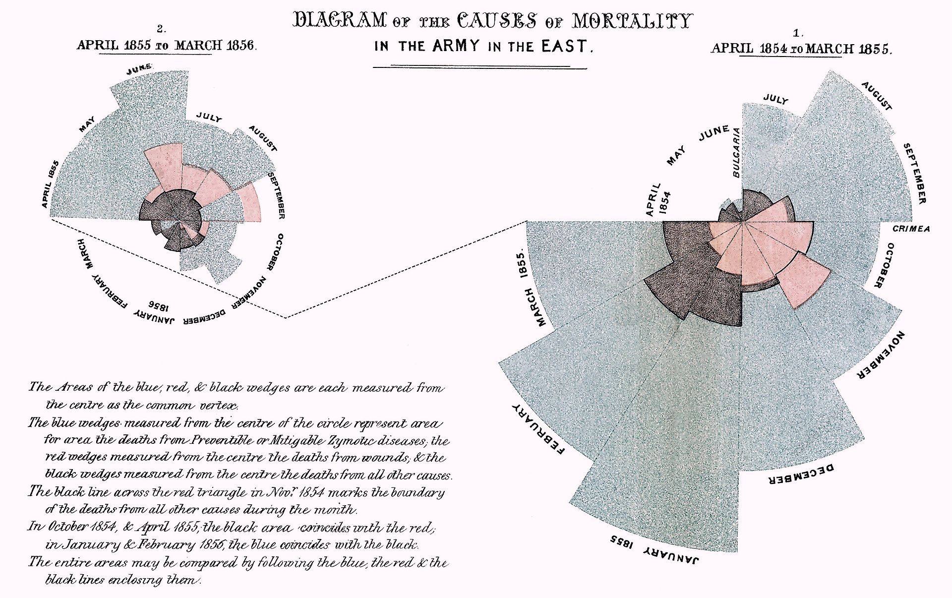
Bookmarked Florence Nightingale Was Born 197 Years Ago, and Her Infographics Were Better Than Most of the Internet's (Atlas Obscura)

With such a massive tome on offer, though, Nightingale feared that this most vital conclusion might be overlooked. So she developed a series of charts meant to make it even clearer to the reader. Her most famous graph, displayed at the top of this article, shows the number of soldier deaths per month from various causes. Each pie slice represents a different month, from April 1854 through March 1856, and each color stands for a different cause of death. It takes just a quick glance to achieve the two main takeaways: that disease, colored blue, killed far more soldiers than either “wounds” (red) or “other” (black), and that it was reduced greatly in 1855.

Celebrating the birth of Florence Nightingale, Cara Giaimo discusses her impact in regards to the spread of ideas, not just as the ‘Lady with the Lamp’. After returning from Crimea, Nightingale spent two years putting together her notes and data. Fearing that the conclusions might be lost in the length of the report, she developed a series of infographics, some of which she even leaked to the press.

It is interesting considering this in light of the modern world where all information is presented to the press using such visuals and then the scientific community. I wonder if it would have still been lost in the noise?

Bookmarked We need to deal with data privacy in our classrooms — University Affairs (universityaffairs.ca)

Data is the currency of the tools we enhance our classrooms with. Yet no individual educator can assure safe usage: there are simply too many tools and too many TOS that aren’t meant to be read, or that don’t address educational or ethical concerns.

As a sector, we don’t have to cede our educational infrastructures to corporate entities and data brokers. We could use our collective voices and procurement power – on postsecondary campuses and in K-12 – to demand that educational technology platforms post clear, plain language, and pedagogically-focused data privacy assurances. As institutions and individuals, we could refuse tools that don’t comply. We could protect our students from extraction and surveillance, while educating them – and ourselves – about privacy in this brave new world.

This would take a culture shift. Like everyone else living through the last decade, educators have become acculturated to a “click yes and ignore” approach to data.

Bonnie Stewart reflects upon the online learning with the return to the classroom in a post-COVID world. She discusses the problem we have with understanding terms of service and data privacy. One suggestion provided is to come together and work collaboratively to understand the impact.
Bookmarked Online Abortion Pill Provider Hey Jane Used Tracking Tools That Sent Visitor Data to Meta, Google, and Others – The Markup (themarkup.org)

Personal information from reviewers was also exposed until The Markup’s inquiry

Jon Keegan and Dara Kerr use Blacklight privacy inspector to demonstrate the data collected by trackers on abortion sites. It is another example of the way in which insight and awareness can be produced from the data trail we leave.
Bookmarked The Hot List: The Rise and Fall of the Singles Chart (medium.com)

From Vera Lynn to Ed Sheeran, the past 50 years of the music industry wouldn’t have been possible without the singles chart. It was more than just a list; it was the beating heart of music culture in an era when the limitations of physical distribution meant that the chart could create a shared experience out of the passionate, tribal world of pop music.

As the way we listen to music changes, from charts to playlists, we might be losing not just the chart, but this shared experience as well.

Matt Locke dives into the way in which the notion of the ‘singles chart’ was concocted in association with advertising. In time, it came to stand as a measure for success, leading to a focus on gaming the count.

Within a decade of its invention, the music industry would be focused around achieving chart success, with entire teams spending millions of dollars to try to make sure their artists reach that coveted number one spot. What was it that made the chart, this simple list, so economically and culturally significant?

Overtime, this measurement has morphed to adjust the changing medium. This is something Matthew Ball discusses in regards to SoundScan the change that it brought about in 1991.

Locke also starts the piece with an nice quote about culture:

he actions that define culture are rarely deliberate. Culture is, in many ways, an accumulation of accidents, small gestures and stumbles that somehow end up sticking together like a giant snowball rolling down a hill. Every successful band has the moment when they almost gave up just before their breakthrough; every artistic movement has its rejections, arguments, and fistfights; every book has a graveyard of characters and scenes that were killed to make way for the story. The end result may look neat — libraries of books ordered alphabetically, artworks organized into linear chronologies — but the process of making culture is anything but.

Liked Can Data Die? Tracking the Lenna Image (The Pudding)

To me, the crux of the Lenna story is how little power we have over our data and how it is used and abused. This threat seems disproportionately higher for women who are often overrepresented in internet content, but underrepresented in internet company leadership and decision making. Given this reality, engineering and product decisions will continue to consciously (and unconsciously) exclude our needs and concerns.

Bookmarked In the Pursuit of Knowledge, There Be Dragons – danah boyd – Medium by danah boyd (Medium)

When you build a visualization tool, you will want to see it for all that it can be, for all that it can do. That is only natural. It takes significant effort to see the complexity of your own work. But doing so is important. Visualizations have power. They can convey information and amplify certain interpretations. This means that they are political artifacts, regardless of what you may wish them to be. My ask of you today is simple: pay attention to the limits and biases of your data and the ramifications of your choices. Put another way, there be dragons everywhere. Design with care and intention, humility and flexibility.

In a keynote for IEEE Vis 2021, danah boyd asks us to see data and information differently. Rather than being seduced by the illusion of precision, we need to consider the limits of data and the biases embedded within visualisations.

Data cannot speak for themselves. Data are never neutral. Data have biases and limitations, vulnerabilities and uncertainty. And when data are put into a position of power, data are often twisted and contorted in countless ways. As the economist Ronald Coase once said, “if you torture the data long enough, it will confess.”

Learning how to truly see data is one of the hardest parts of doing data science. The first step is recognizing that data cannot be taken for granted. Data must be coaxed into showing their weaknesses. The weaknesses are not always obvious. As a tool, visualization can help reveal data’s weaknesses, or obscure them.

Associated with all of this is the context in which data is used. boyd argues that visualizations can help reveal data’s weaknesses, or obscure them.

The work of visualization — like the work of animation — is fundamentally about communication. Even if your data are nice and neat, the choices you make in producing a visualization of that data shape how those data will be perceived. You have the power to shape perception, whether you want to or not. There is no neutral visualization, just as there is no neutral data. Thus, in building your tools, you must account for your interlocutors. What are you trying to convey to them? When do you need to stretch the ball so that the viewer sees the information as intended?

The challenge we face is being conscious of these limitations and the way in which data is politicized and perverts.

When you build a visualization tool, you will want to see it for all that it can be, for all that it can do.

It is interesting to consider this in regards to my work with schools and absence data. I am often asked to represent seemingly simple questions, such as how many days was x away or how many days was x late? One of the biggest problems is that this is often based on assumptions that the data has been entered both correctly and uniformly. For example, what constitutes a ‘late’? Is it when a student arrives at 9:15am? What about 10:30am after an appointment? In addition to this, when you count absences or attendances, are you counting excursions? Days that students have been asked to work from home? Days when students have stay home due to having symptoms? I feel this only becomes more confusing when you step back and view the numbers at large.

Liked Are You In The System Yet, Sir? by Wouter GroeneveldWouter Groeneveld (brainbaking.com)

In the end, abusing our personal data has the opposite effect: we’re disgusted by companies that won’t leave us alone, even if we mail, call, and yell at them to please remove our data in accordance with the GDPR. Some bigger multimedia stores even ask for your ID card “to put the reductions on”. When queuing up at the cash register, I see 90% of the people in front of me whipping out their ID and handing it over, where it gets “scanned” somewhere behind the counter. All it takes is a no, although admittedly, I could do without the stress.

Bookmarked What do we talk about when we talk about ‘data’ in schools? by Neil (data-smart-schools.net)

One of the main conclusions from our DSS project is a very simple one – academic researchers, policy-makers, business interests, tech companies, administrators, school leaders, and teachers are often talking about very distinct and different forms of ‘data’ within schools and school systems.

Neil Selwyn unpacks what it is we talk about when we talk about data in education:

  • System-level digital data as a form of education governance
  • Data-Driven Decision Making (DDDM)
  • Trace data generated from official systems and learning platforms
  • Trace data generated routinely in classrooms and school
Bookmarked How Data Science Pinpointed the Creepiest Word in “Macbeth” by Clive Thompson (onezero.medium.com)

What’s so delightful about Hope and Witmore’s work is how it’s genuinely a cyborg, centaur piece of literary analysis. They started by pondering a phenomenon that has puzzled Shakespeare fans for centuries. They did some data analysis that pointed to the word “the”. But to figure out why “the” was so key, they had to go back and reread the play closely, engaging in a very rich line-by-line literary analysis. The computation existed as a set of fresh alien eyes, telling the humans where to direct their attention. But it was up to the humans to find the meaning.

Clive Thompson discusses the research of Jonathon Hope and Michael Witmore and their discovery through a mixture of textual analysis and close reading to uncover the power of the word ‘the’ in Shakespeare’s Macbeth. For a simple introduction to textual analysis, Plotting Plots allows users to plot the frequency of words associated with a range of books.
Replied to Delight 19: Data – Ideas and Thoughts (ideasandthoughts.org)

I guess I’m a numbers guy. I like data and yes, I find delight in data. My phone is full of data. Maybe the key is that I find delight in it but I don’t find all the answers it in. Delight has a bit of a whimsical feel that can sometimes place things in their proper perspective.

Dean, I have actually found myself moving away from reflecting excessively reflecting upon data and analytics. I kind of fear being something of a slave to the data, that I lose sight of my why. For example, there was a time when I looked at how many clicks I got on a post or retweets etc. Like danah boyd, I had become somewhat addicted to stats:

Stats have this terrible way of turning you — or, at least, me — into a zombie. I know that they don’t say anything. I know that huge chunks of my Twitter followers are bots, that I could’ve bought my way to a higher Amazon ranking, that my Medium stats say nothing about the quality of my work, and that I should not treat any number out there as a mechanism for self-evaluation of my worth as a human being.

I believe there is a limit to what data can tell us or inform our practice, especially in regards to context and creativity.

In regards to Cricket, I read an interesting reflection from Andre Borovec recently. Although we have a multitude of data at our fingertips, we also need to be mindful how this is utilised.

The danger, Andre Borovec says, is taking away players’ creativity and instinct.

Borovec oversaw the Renegades’ opposition analysis during their title year in BBL|08 and admits their regular game plan had to go out the window during their remarkable final victory over rivals Melbourne Stars.

When the Stars were showing the first signs of a batting collapse in pursuit of a modest target, Renegades skipper Finch brought back strike quick Chris Tremain to bowl the 14th over.

A less flexible skipper would have stuck to the plan of bowling spin through that period, but Tremain immediately dismissed dangerman Glenn Maxwell and the Stars folded in spectacular fashion.

I think it is like connecting the dots, sometimes this can be positive and productive, however sometimes it can lead to conspiracy theories.

As a side note, I have enjoyed dipping into bits of the Data Smart Schools project. Also have Tim Harford’s The Data Detective on my list of books to read. However, the quote that has left me thinking the most about data recently has been this from Nassim Nicholas Taleb:

In refusing to run to catch trains, I have felt the true value of elegance and aesthetics in behavior, a sense of being in control of my time, my schedule, and my life. Missing a train is only painful if you run after it! Likewise, not matching the idea of success others expect from you is only painful if that’s what you are seeking.

Bookmarked Ben Grosser: Planning the Exodus from Platform Realism by Institute of Network Cultures | Geert Lovink (networkcultures.org)

We need a turn away from the private and a return to the public. Without a private profit motive, many of the problems with big tech platforms would fall away. I say this knowing full-well that making such systems public is by no means a solution by itself. We’ve seen unprecedented corruption of and new justified distrust in public institutions over the last many years. But big tech’s platforms are decidedly anti-public, and this positioning is part of what makes them so damaging to privacy, agency, and democracy.

Ben Grosser discusses the need to turn away from private for-profit platforms to more public entities whose interest is not profit. Associated with this, Grosser outlines a set of shared values to support this move:

SLOW — We need media that actively and intentionally works against the platform capitalist idea that speed and efficiency is always desirable and productive.
LESS — We need alternatives that advance an anti-scale, anti-more agenda. Facebook’s answer to the negative effects of platform scale post-2016 was to foreground Groups to “give people the power to build community.” Four years later that platform-produced power propelled racism and authoritarianism to new heights, culminating (so far) in a violent insurrection at the US Capitol.
PUBLIC — Social media infrastructure for 3 billion+ users should never be driven by profit or controlled by single individuals. Ditto goods distribution (Amazon), information access (Google), etc.
DECOY — To help produce a culture of platform exodus we need new projects/works that get into the platforms and help users turn themselves away from them.

As a part of the Data Smart Schools project, Neil Selwyn reflects on what such a move might mean for education:

We might develop an LMS that does not continuously extract data and create profiles of students from their online activities, but occasionally invites students to divulge any information that they feel it is useful for their schools to know. We might have a system that only allows a student or teacher to access it for a finite number of times a week – meaning that people ration their use, and log-in only when really necessary or useful. We might have a system that only allows new messages or comments to be added during week-day mornings – thereby reducing the compulsion to check for new messages during the evenings or weekends …. other forms of technology are possible!

This reminds me of Jim Groom’s​ discusses the Next Generation Digital Learning Environments and the challenge of and managing our personal data online. I am also left thinking about the association with Eli Pariser’s idea of ‘public parks‘.

Replied to Using Google Sheet to manage student and teacher workload (Alice Leung)

The week numbers are the column headings and the subject names are the row headings. If the Google Sheet is shared, teachers can check the boxes to indicate the week they would like an assessment task for their subjects to be due. The running tally automatically adds up the assessment tasks for a week. This can be used to indicate if particular weeks would have too many assessments due. The check boxes allow teams of teachers to have a discussion to moving assessment due dates and the running tally accurately updates the number of assessments per week. So if assessments have to be moved, it makes the negotiation process more efficient.

Alice, this is a great demonstration of the collaborative power and potential of Google Sheets. In particular, I like the possibilities to query data for different information. For example, I made a copy and had a tinker with your template, creating a query of the particular assignments for a given week generated from a wildcard.

=IF($Q2="Week 1",{QUERY(A4:M58,"SELECT A WHERE C = TRUE")},
IF($Q2="Week 2",{QUERY(A4:M58,"SELECT A WHERE D = TRUE")},
IF($Q2="Week 3",{QUERY(A4:M58,"SELECT A WHERE E = TRUE")},
IF($Q2="Week 4",{QUERY(A4:M58,"SELECT A WHERE F = TRUE")},
IF($Q2="Week 5",{QUERY(A4:M58,"SELECT A WHERE G = TRUE")},
IF($Q2="Week 6",{QUERY(A4:M58,"SELECT A WHERE H = TRUE")},
IF($Q2="Week 7",{QUERY(A4:M58,"SELECT A WHERE I = TRUE")},
IF($Q2="Week 8",{QUERY(A4:M58,"SELECT A WHERE J = TRUE")},
IF($Q2="Week 9",{QUERY(A4:M58,"SELECT A WHERE K = TRUE")},
IF($Q2="Week 10",{QUERY(A4:M58,"SELECT A WHERE L = TRUE")},
IF($Q2="Week 11",{QUERY(A4:M58,"SELECT A WHERE M = TRUE")}
)))))))))))

I then built upon this query to generate a unique list of subjects with an assignment:

=UNIQUE(IF($Q2="Week 1",{QUERY(A4:M58,"SELECT B WHERE C = TRUE")},
IF($Q2="Week 2",{QUERY(A4:M58,"SELECT B WHERE D = TRUE")},
IF($Q2="Week 3",{QUERY(A4:M58,"SELECT B WHERE E = TRUE")},
IF($Q2="Week 4",{QUERY(A4:M58,"SELECT B WHERE F = TRUE")},
IF($Q2="Week 5",{QUERY(A4:M58,"SELECT B WHERE G = TRUE")},
IF($Q2="Week 6",{QUERY(A4:M58,"SELECT B WHERE H = TRUE")},
IF($Q2="Week 7",{QUERY(A4:M58,"SELECT B WHERE I = TRUE")},
IF($Q2="Week 8",{QUERY(A4:M58,"SELECT B WHERE J = TRUE")},
IF($Q2="Week 9",{QUERY(A4:M58,"SELECT B WHERE K = TRUE")},
IF($Q2="Week 10",{QUERY(A4:M58,"SELECT B WHERE L = TRUE")},
IF($Q2="Week 11",{QUERY(A4:M58,"SELECT B WHERE M = TRUE")}
))))))))))))

To do this, I added an additional column associated with the assignments associated with the subjects.

One other thing I wondered is whether this could be achieved with each subject recording their own information and then feeding it all into a master sheet using the IMPORTRANGE formula. I have discussed my use of this elsewhere. Separating the data can be a way of managing the data without stepping on each others toes (or cells).

Bookmarked Data Games with Google Sheets by Tom Woodward (bionicteaching.com)

This is for a workshop with students on Saturday. It’s a revision of a thing Jeff and I did a way back in 2018. I think I’ve come up with some improved examples and I’ve revised a few things. The goal is to let any skill level start to see how spreadsheets can be useful to them. The videos are…

Tom Woodward provides a range of strategies for digging into data. This is a useful collection, along with Karl W. Broman and Kara H. Wood’s tips for data organisation and Ben Collins’ best practices.